Design and Visual Content:

Kroger R&D Banners plus Mix & Match Logo Design

Emerson Heating & Cooling Company Ads
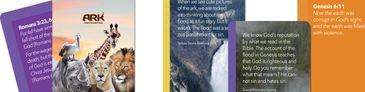
Answers In Genesis Swivel Book Design
Answers In Genesis Swivel Book Design
Videos:
EHC Co. Spring Maintenance Ad
- Problem: Spring maintenance can be easy to postpone because the benefits are not always immediately visible. The communication challenge is to make seasonal service feel practical, reassuring, and worth scheduling without overwhelming the viewer with technical detail.
- Solution: The video solves this by organizing the message around a clear promise: “Comfort made simple.” The design pairs a warm family image with straightforward service benefits—prevent breakdowns, improve efficiency, and breathe cleaner air—so the viewer understands both the emotional value and the practical reasons for scheduling maintenance. The vertical layout works well for social media, with the EHC logo placed prominently at the top, service imagery in the lower half, and a consistent call-to-action bar anchoring the bottom of the frame. The transition from technician/service imagery to thermostat and equipment visuals reinforces that the company provides both hands-on maintenance and comfort-system solutions.
- Result: The finished video turns a routine service reminder into a simple, trust-building message. It communicates comfort, prevention, efficiency, and clean air in a few seconds, while keeping the company name, phone number, license information, and scheduling action visible. The result is a clean, locally branded social media ad that makes spring maintenance feel approachable, useful, and easy to act on.
When Local Partnerships Shape Global Narratives Essay
- Problem: Research for an American Israelite microbrewery review of MadTree Brewing uncovered material that belonged outside a standard venue article. The challenge was to keep the review focused while still addressing a separate concern: the public use of charged language about Israel.
- Solution: The video became a companion visual editorial to an essay listed under Opinion. Its restrained design—dark background, formal typography, slow pacing, and isolated claims—created space to examine terms such as occupation, apartheid, torture, and genocide one by one rather than letting them accumulate as emotional shorthand.
- Result: The piece protected the focus of the brewery review while giving the larger issue its own disciplined form. It shows editorial judgment, scope control, and the ability to use design, pacing, and typography to support serious written commentary. (See Essays→Opinion→When Local Partnerships Shape Global Narratives.)
The Lie That Wears a Face Essay
- Problem: “The Lie That Wears a Face” explores self-misrepresentation as something more unsettling than a single false statement. The communication challenge was to create an essay header and companion video that could introduce that idea visually: the moment when an ordinary interaction begins to feel false, strained, and difficult to trust.
- Solution: The design uses a familiar café conversation as the setting for quiet discomfort. The essay header establishes the central visual metaphor, while the video extends it through subtle expression, pacing, and contrast. A warm social environment is set against the man’s artificial, masklike face and the woman’s guarded attempt to remain polite. This contrast turns an abstract moral idea into a readable human scene: deception is not only spoken; it can be performed.
- Result: The finished header and video give the essay a memorable visual identity. Together, they prepare the reader for the story’s theme by making self-misrepresentation feel relational, uneasy, and slightly absurd. The result is a clear editorial design solution that supports the writing with humor, discomfort, and visual storytelling. (See Essays→Opinion→ (scroll down) The Lie That Wears a Face.)
Editorial Photography
David W. Bordine of Bay Village, Ohio, displayed glass art by Classic Glass at Summerfair, including kaleidoscopes, dragonflies, sailboats, and a tribute piece inspired by a Sailing World Cup winner.
This website uses cookies.
We use cookies to analyze website traffic and optimize your website experience. By accepting our use of cookies, your data will be aggregated with all other user data.